
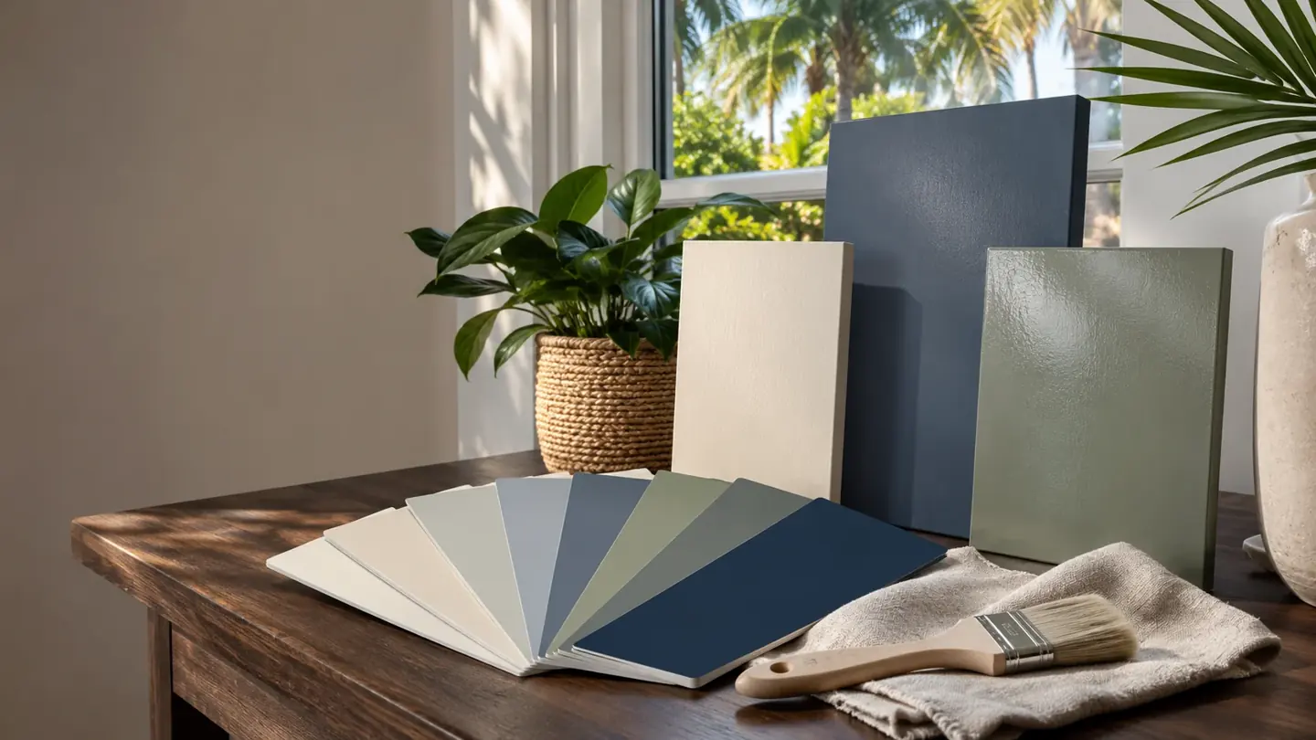
A paint color guide for your actual space
This paint color guide starts with a simple idea: the right choice belongs to the room or property in front of you. A color can look appealing online and still feel different beside your flooring, cabinetry, or roof. WJ Custom Paintng LLC encourages a considered selection process for Naples interiors, exteriors, and commercial spaces.
Begin by identifying the elements that will stay. Then describe the mood you want to create. You may prefer a warmer home, a lighter room, or a stronger business identity. Those goals provide a useful direction. They also help distinguish an inspiration image from a final specification for the work.
Look at the materials before the paint
Fixed materials influence the palette. Floors, stone, cabinetry, countertops, and large furnishings can carry warm or cool undertones. Outside, roofing, pavers, windows, and landscaping also affect the overall impression. Review these elements together before deciding that a particular wall color is the answer.
For a residential project, our home painting information helps connect the spaces. Consider which rooms are visible from one another and where a transition feels natural. A cohesive palette does not require every surface to have the same color. It means the choices have a clear relationship to one another.
Use physical samples in more than one position
Screen images are useful for gathering ideas, but they cannot reproduce an actual painted finish. A physical sample lets you compare the color with nearby materials and the light in the space. View it in several positions before making a decision. A sample beside a window may read differently from one farther inside.
Our interior painting service page explains related room planning. In this paint color guide, the practical advice is to slow down the final selection. Compare a small number of realistic options rather than collecting endless unrelated choices. Record what you like about each and what seems less suitable.
Notice daylight and the lighting you use
A room changes throughout the day. Natural light may be strong in one area and limited in another. Evening lamps and ceiling fixtures create another view of the same surfaces. Evaluate samples under the lighting you actually use, including the conditions in which the room matters most to you.
For example, a bedroom may be used mainly in softer evening light. A workspace may need to feel comfortable during daylight hours. A restaurant may have a very different lighting atmosphere from a retail shop. The commercial painting page helps connect those operational details with the broader scope.
Consider sheen as part of the surface decision
Color and sheen work together, but sheen is not a standalone answer. Surface texture, visible imperfections, cleaning needs, and the intended use of the space all belong in the discussion. Different products may also describe finish levels differently. Review the actual coating rather than relying on a general label alone.
WJ Custom Paintng LLC uses Sherwin Williams paints. Discuss the proposed product and finish for each surface as part of the project plan. Our painting process overview explains how selections connect with preparation and scope. The paint color guide should support that conversation, not replace product specific information.
The finish also depends on what happens before application. Our team emphasizes taping, masking, protecting the space, and preparing surfaces before coating. We can roll and spray. The suitable method is considered with the surface and finish, rather than selected simply because an inspiration photograph suggests a particular look.
Use this paint color guide for exterior choices
An exterior color scheme needs to work with the architecture and materials that remain. Look at roof tones, stone, doors, windows, and paved areas together. Then decide which features should feel quiet and which deserve emphasis. A restrained contrast can be more effective than adding several competing accent colors.
Read our exterior painting information before finalizing the plan. If an association or property owner must approve colors, confirm that process early. A preferred sample is not the same as an approved selection. Keep a written record of the agreed colors and the surfaces assigned to them.
Use inspiration without copying the whole scene
A photograph contains more than paint. Its lighting, furnishings, landscaping, camera settings, and surrounding materials all contribute to the impression. When you like an image, identify the particular relationship that appeals to you. It might be warm walls against white trim or a dark door within a quiet exterior palette.
The images on this website are generated design inspiration, not completed WJ projects. Use them to describe a direction rather than to identify an exact paint product. A paint color guide is most useful when it helps you ask better questions about your own space. Final choices should still be checked with physical samples.
Keep the final selections easy to follow
Once you choose a direction, record each color, sheen, and included surface. Identify who has authority to approve those selections. This is especially useful when several people are involved or when different rooms use related colors. A written list reduces the chance of an informal description being interpreted differently.
Visit request a painting estimate to send your project details, or call WJ Custom Paintng LLC at (239) 345 0077. The online form emails your enquiry to the company. Describe your references and initial preferences in the project notes, even if the final palette is still taking shape.
COLOR IN THE DETAILS
Look up.
The ceiling counts.
A muted green ceiling and crisp white trim bring contrast to this interior. Consider the walls, ceiling and woodwork together. Confirm your color with physical samples in the light of your own home.
Plan your interior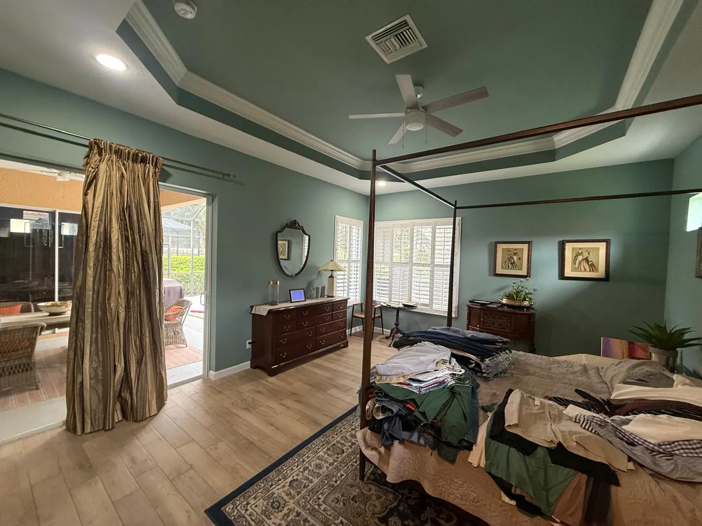
Your questions.
Considered answers.
Can you identify a paint color from a website image?+
An image can provide a general direction, but it cannot reliably identify a specific paint color. Lighting and image processing affect its appearance. This paint color guide recommends choosing physical samples and reviewing them beside the actual materials in your space before approving a final selection.
Should trim and walls always be different colors?+
No single arrangement suits every property. Consider the architecture, existing materials, and level of contrast you want. Sometimes a quiet relationship works well; other spaces benefit from more distinction. Discuss walls, ceilings, doors, and trim as related surfaces rather than making each choice in isolation.
What should I bring to a color discussion?+
Bring a few references, the names of any existing colors you know, and information about materials staying in place. Explain the feeling you want and the choices you dislike. WJ Custom Paintng LLC can use that context to discuss your painting scope and the selections that still need confirmation.
YOUR SPACE. A FRESH PERSPECTIVE.
See the potential.
Let’s bring it to life.
Thoughtful preparation. Beautiful color. A painting plan built around your space. Let’s talk about what comes next.
